
Waterjel
TM
Waterjel
TM
Waterjel
TM
001. Project Overview
Modernizing a legacy burn care brand for the next generation of emergency response.
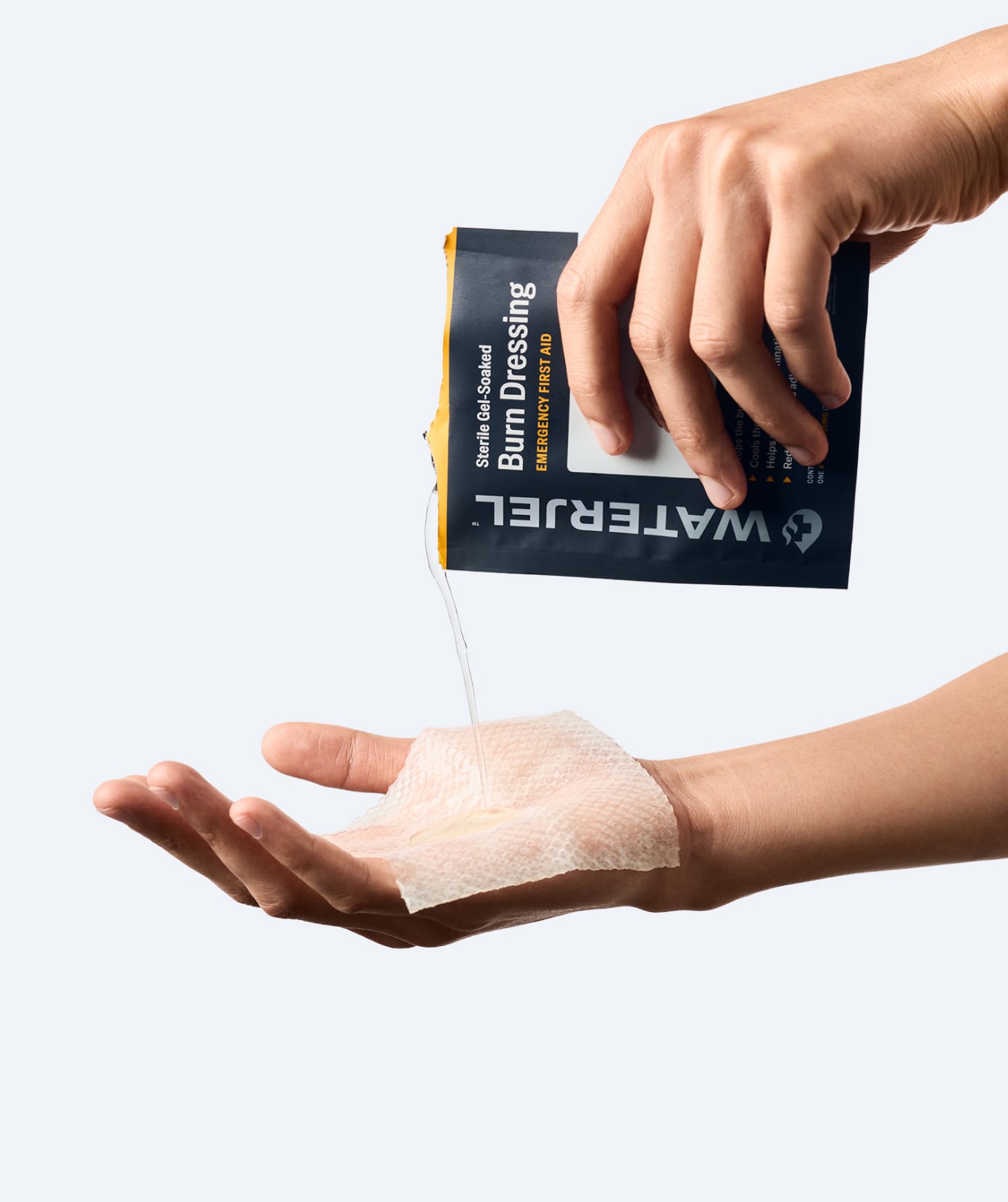
Following Safeguard Medical’s acquisition of Waterjel, the brand existed in multiple forms across the market, creating confusion and inconsistency across products. We unified the visual identity and packaging system to establish a more cohesive presence, improving how products are recognized and understood. The updated system builds on the legacy brand with refined marks, typography, and color, alongside redesigned packaging and product photography that more clearly communicates the product’s gel-soaked application.
Services
Visual Identity
Brand Systems
Packaging
Art Direction
Content Production
Industry
Healthcare
Emergency Response
Agency
Mode
001. Project Overview
Modernizing a legacy burn care brand for the next generation of emergency response.
Following Safeguard Medical’s acquisition of Waterjel, the brand existed in multiple forms across the market, creating confusion and inconsistency across products. We unified the visual identity and packaging system to establish a more cohesive presence, improving how products are recognized and understood. The updated system builds on the legacy brand with refined marks, typography, and color, alongside redesigned packaging and product photography that more clearly communicates the product’s gel-soaked application.
Services
Visual Identity
Brand Systems
Packaging
Art Direction
Content Production
Industry
Healthcare
Emergency Response
Agency
Mode


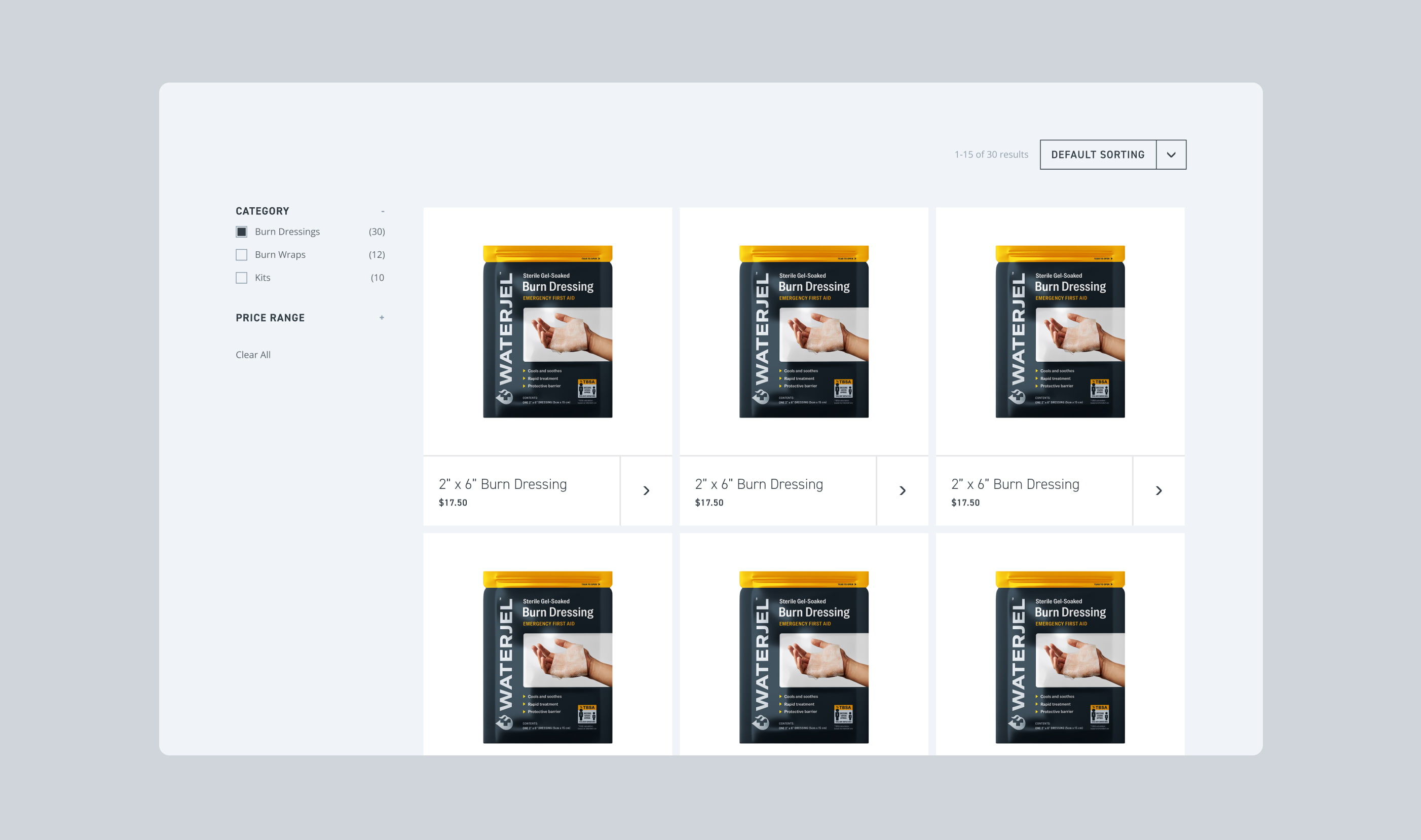
002. Packaging
A unified packaging system built for critical moments in the field.
Building from the refreshed identity, we developed a new packaging system that could scale across Waterjel’s full product range while remaining instantly recognizable in the field. The system leveraged the updated photography, refined typography, and a simplified information hierarchy to improve readability, strengthen product differentiation, and create consistency across the portfolio.

003. Digital Experience
Announcing the refreshed Waterjel brand through interactive storytelling.
To support the relaunch, we designed and developed a new landing page that introduced the refreshed Waterjel brand through immersive product storytelling. Interactive moments highlighted the liquid formula and protective qualities of the treatment while bringing the new visual system to life digitally. Leveraging the updated photography and refined visual language throughout, the experience balanced clinical credibility with a more modern digital presence.

Thanks for taking a look. Want to see more?
Social
© 2026 Will Green
Thanks for taking a look. Want to see more?
Social
© 2026 Will Green
Thanks for taking a look. Want to see more?
Social